
90 mins
Designing a Band Logo
What is a logo, what are the elements of effective logo design, and how have musicians and bands used logos to brand themselves?
Essential Question
What is a logo, what are the elements of effective logo design, and how have musicians and bands used logos to brand themselves?
Objectives
Know (knowledge):
- What the meaning and function of a logo is
- Basic principles of semiotics and associations
- Principles of effective logo design
Mastery Objective:
- Through the analysis of images and through group discussion, students will be able to identify and understand principles of effective logo design, and apply their knowledge by designing their own logos.
Background
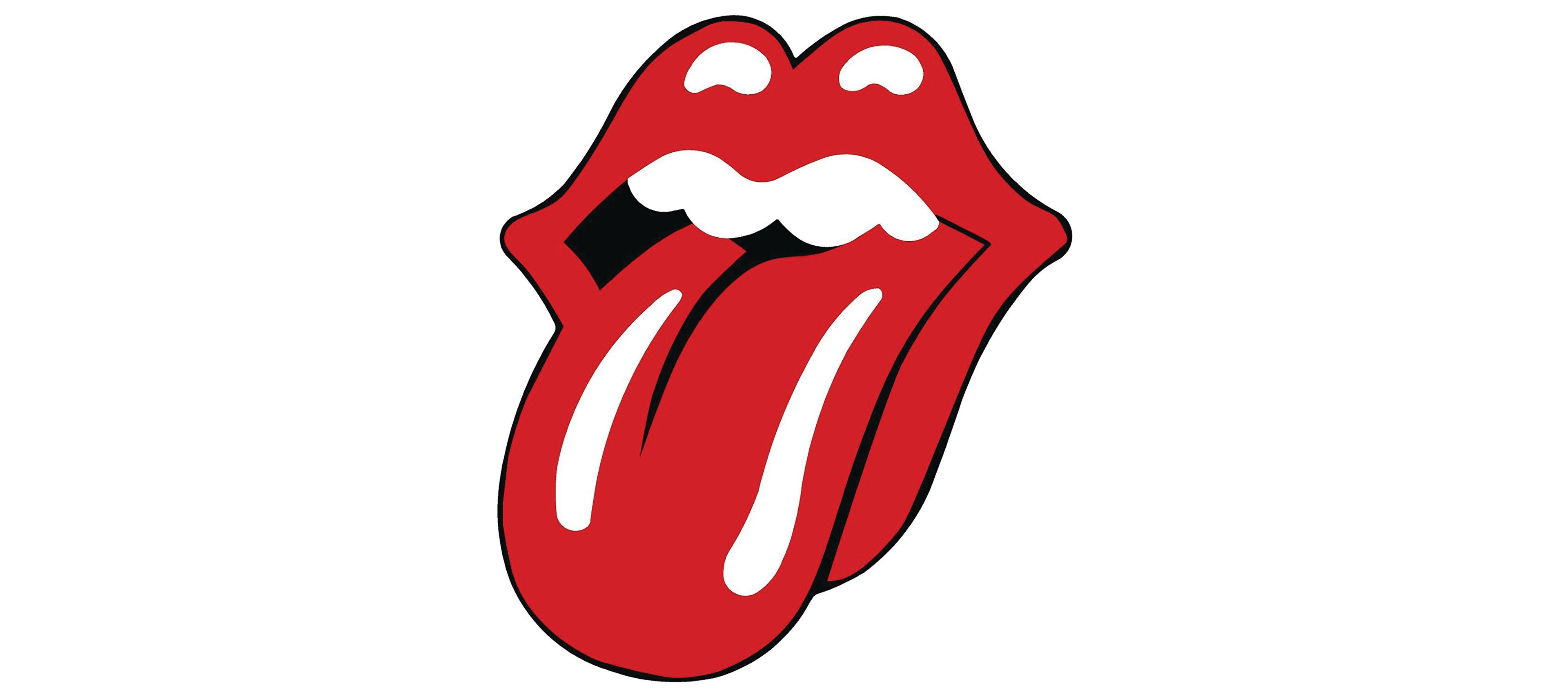
In 1969, Mick Jagger of the Rolling Stones contacted the London Royal College of Art in search of a student who might design the poster for the band’s upcoming tour. Graduate student John Pasche took the job. Pasche’s design so impressed the band that Jagger enlisted him to create a logo for the record label they were preparing to launch.
In 1970, Pasche spent a week developing the Rolling Stones logo, considering what image might best reflect the band’s status as the “bad boys” of Rock and Roll. While designing the logo, Jagger showed Pasche an image of the open-mouthed, red-tongued goddess Kali, a Hindu deity associated with sexuality and violence. While this might have played a part in inspiring the logo, Pasche later recalled feeling equally transfixed by the facial features of Mick Jagger himself. “Face to face with him,” said Pasche in a 2008 Rolling Stone magazine interview, “the first thing you were aware of was the size of his lips and his mouth.”
A preliminary, one-inch version of Pasche's design was sent to Craig Braun, who was developing the cover to the band's upcoming release, Sticky Fingers. Braun and his associate designers took Pasche's initial design and made some modifications, before enlarging the logo to cover the entire inside cover of the album.
Whether inspired more by the rictus of Kali or Jagger, Pasche and Braun's design, “The Tongue,” was a success. It is still used by the Rolling Stones almost fifty years later.
“The Tongue,” wild though it may be, followed certain basic principles of design. Pasche wanted the logo to represent the spirit of the band in a manner that could be, “easily reproduced and...stand the test of time.” A representative of the London Victoria and Albert Museum, who purchased the original “Tongue” artwork for $92,500 in 2008, described the logo as “one of the first examples of a group using branding and...arguably the world's most famous rock logo.”
During the pre-internet era of print, logos such as “The Tongue” served several important purposes. Most fans discovered music through the radio, from which they received no images. Until MTV launched in 1981, listeners either saw a band in person, or on the pages of print media, where space was limited. A clear, memorable logo could leap from the page and lodge itself in a fan’s psyche. A well designed logo often could be easily reproduced by fans--on notebooks, desks, lockers, clothing, even human skin. In the era before the internet and one-click sharing, a good logo “went viral” via a pen and the closest canvas, exposing bands to new audiences in a way paid advertising never could.
In this lesson, students explore band logos as examples of graphic design, and consider how logos derive meaning through association with the bands they symbolize. Guided by a handout that introduces Five Principles of Effective Logo Design, students study images of band logos and analyze their effectiveness. Armed with a new sense of what might make logos effective, students then design logos for their own fictitious, or real, bands.